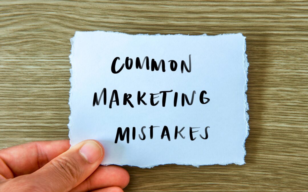
While the advent of digital marketing has seen an explosion of competition in legal services, many lawyers remain averse to branding and marketing efforts. But a strong brand and well-developed marketing strategy is no longer optional for firms that want to stand out and get ahead in an increasingly competitive market.
Branding helps distinguish your law firm from others. In a saturated market, this is crucial. Your firm needs to be distinct and memorable, or it will get lost among thousands of other firms. It also lets you communicate to clients and potential clients alike what makes your firm relevant, distinctive and worth their money. Many lawyers underestimate just how business-savvy their clients are. They expect professional presentation from law firms, like any other professional services firm, and they will judge a firm based on its branding (or lack of it).
What is bad branding?
Bad branding is inconsistent. The logo appears one way on the firm’s website and another way on business card. Fonts and Colors change across mediums, and there is no consistent style or tone in content. There are no ‘slogans’ associated with the firm, or they vary so widely that there is no cohesive message. Changes to branding are completed ad-hoc, without consideration of a long-term marketing strategy. Sometimes, the branding is just not appropriate or relevant. It doesn’t ‘fit’ the firm, the area of law or the profession in general.
Good branding is the opposite – consistent, relevant, distinctive and memorable.
Logos usually come to mind first when discussing branding, and for good reason. The logo is the ‘face’ of the firm. Images are more memorable than text, and because the logo appears on all firm collateral, it’s important to put thought into your logo design.
The do’s and don’ts of logos.
Don’t: Stock logos.
You may consider purchasing a stock logo because it is cheaper, but you will get what you pay for: a logo that not only looks cheap, but one that might show up as the logo for another firm as well! This is damaging to your firm’s reputation. A custom-designed logo that is tailor-made lends credibility to your firm. It tells prospective clients you’re serious about your work, because if you are willing to spend time, resources and effort on your branding, you’ll do the same for their matter.
Do: Consistency.
Consistency is crucial for strong, memorable messaging. Ensure your logo is the same across all material, online and offline. If you have differences in your logo across collateral, it’s confusing for clients and weakens your marketing strategy.
Consistency also means ensuring your logo looks good in different sizes and on different types of collateral. What looks good small may not look as good when it’s magnified. This is where enlisting a professional designer helps. They can make sure your logo is both rendered in the highest quality and looks great at any size, on any medium.
Don’t: Overused Images
Your branding should always be professional and relevant to your clients’ expectations of law firms. At the same time, traditional images – the scales of justice or the gavel – are overused. These are very common symbols in legal branding, to the point of being stereotypical. If you do want to use them, try to put a creative spin on them to set yourself apart.
Do: Timeless over trendy
When designing your logo, choose design features that will age well. While a style or font may be fashionable now, you’re best to use elements that will look good years from now. A logo grows more commercially powerful the longer it lasts, as more people associate it with your firm. Changing your logo every few years only weakens your marketing strategy.
Don’t: Complicate it
Try not to overcomplicate your logo design with many design features. Something that is simpler will be easier for prospective clients to instantly recall.
Do: Get the right Colors
When it comes to choosing Colors for your logo, it’s important to remember that Colors evoke responses in people. Red is said to convey strength, intensity and action; yellow is optimism, warmth and clarity; blue evokes security, trustworthiness and dependability; green expresses growth, money and health, and both black and white are professional and classic.
These principles are not fixed. An individual’s association with a Color is also influenced by their own circumstances, so don’t choose a Color just because you think it will persuade people to engage your services. The more effective strategy is to choose Colors that ‘fit’ your firm’s personality.
About our guest author
Rachel Williams
Rachel Williams is the CEO of Zaliet, the only global provider of websites to small law firms in the world. Rachel has worked inside small law firms and has delivered technology solutions to small law firms for the past 8 years.